
[In my January 1, 2015 post, I christened this the “Year of Learning” here on the blog. Each post, I’ll aim to share something recently discovered (or re-discovered) in the hope that you might add my learning to your own discoveries and make double-moves forward and upward this year!]
I have always been a bit of a map geek. I can recall browsing through atlases and other such books as a child, simply intrigued at the details in the diagrams presented. I am reminded of this strand of nerdiness every time I encounter a map presenting information in some unique fashion.
For example, consider this map that depicts each nation appropriately sized to its population:
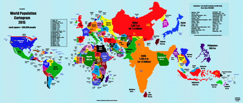
[See full-sized version HERE.]
Or this one that informs us what each nation leads the world in:

[Read more HERE.]
Or how about this one? It’s called the Human Ooze Map. Far less gross than you might imagine, it utilizes a unique style to depict population density.

[Find explanation of this map HERE, if you like.]
So there is our learning for today: Maps are cool, particularly the weird ones!